
Case file: ETL 外星之光
From a sad planet to a happy one.
- Client
- ETL 外星之光
- Industry
- Sustainable home care
- Year
- 2022
- Active ingredients
- Brand strategy & identity, Packaging, print & spatial graphics, Creative direction & campaigns

The symptoms
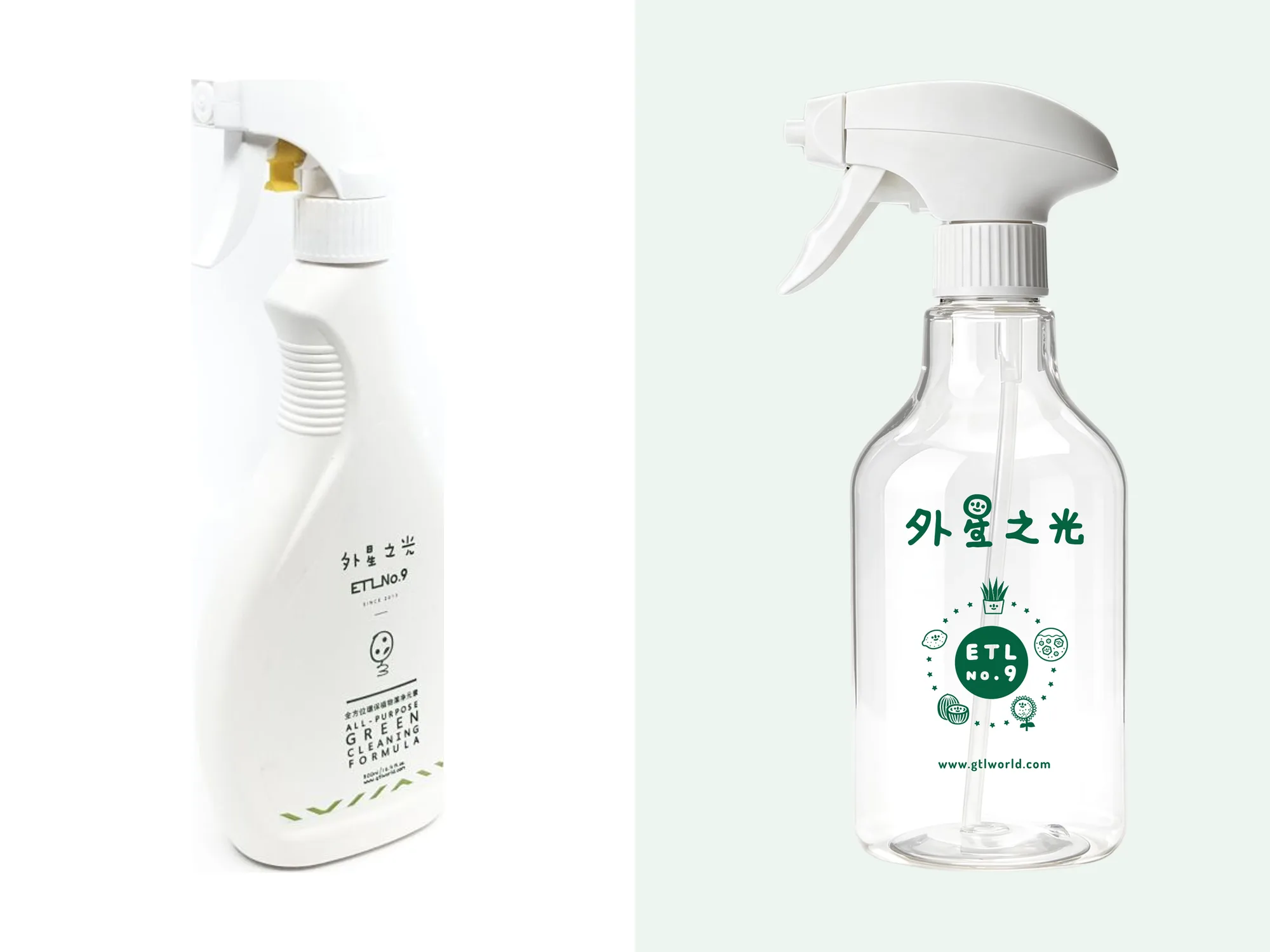
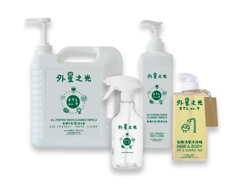
ETL makes environment-first cleaning and personal-care products, born from its founders' work with leaders around the world on environmental issues, through platforms like Asia SEIA and the Global Happiness Forum. Its old mascot was a sad face: the world is a sad place, and ETL is here to save it. Honest, but heavy, and at odds with products meant to make everyday life lighter. The packaging was thin and clinical, and it did not explain what the products actually do.
The prescription
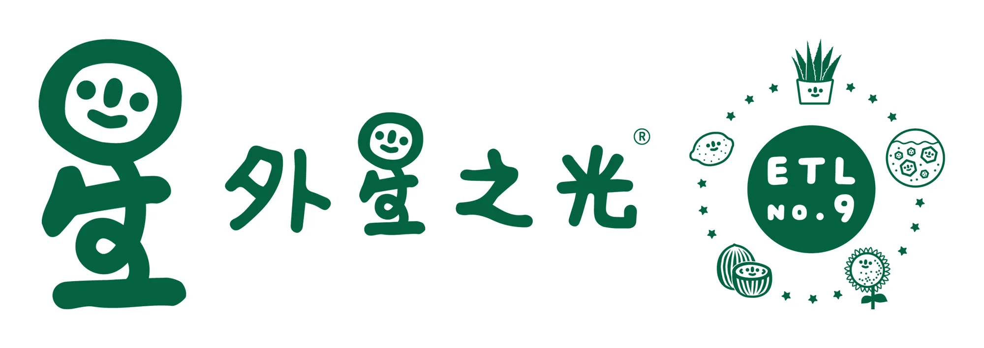
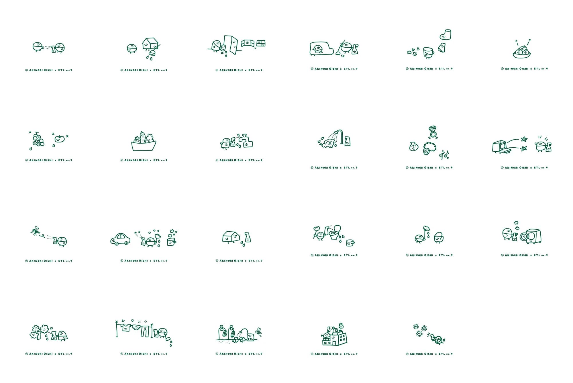
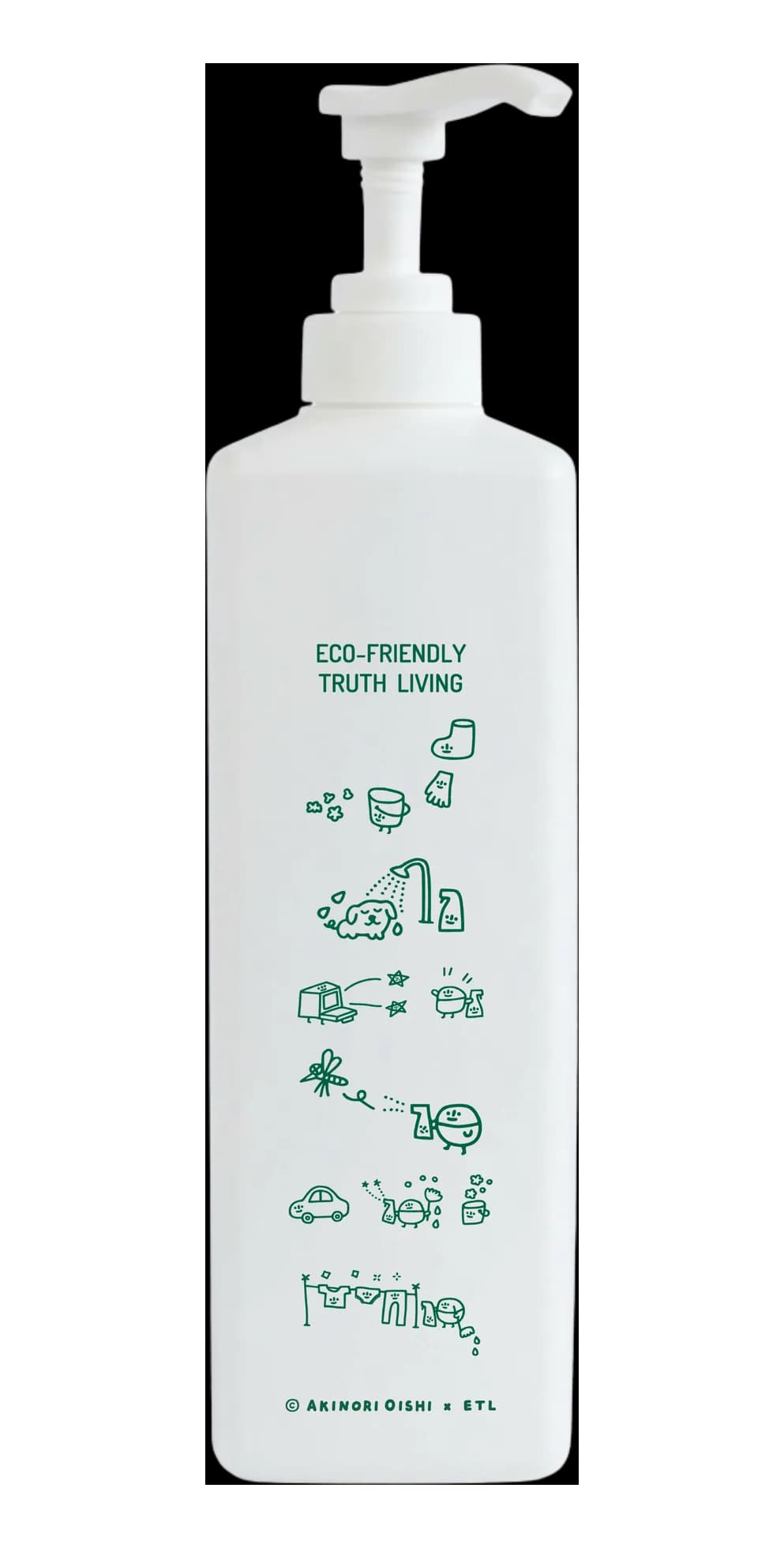
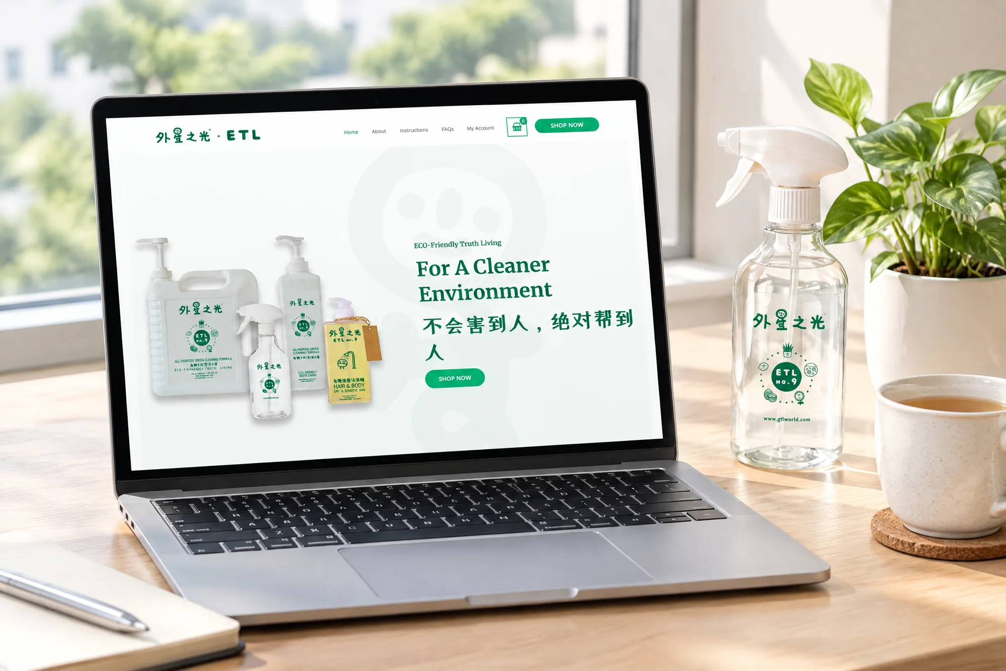
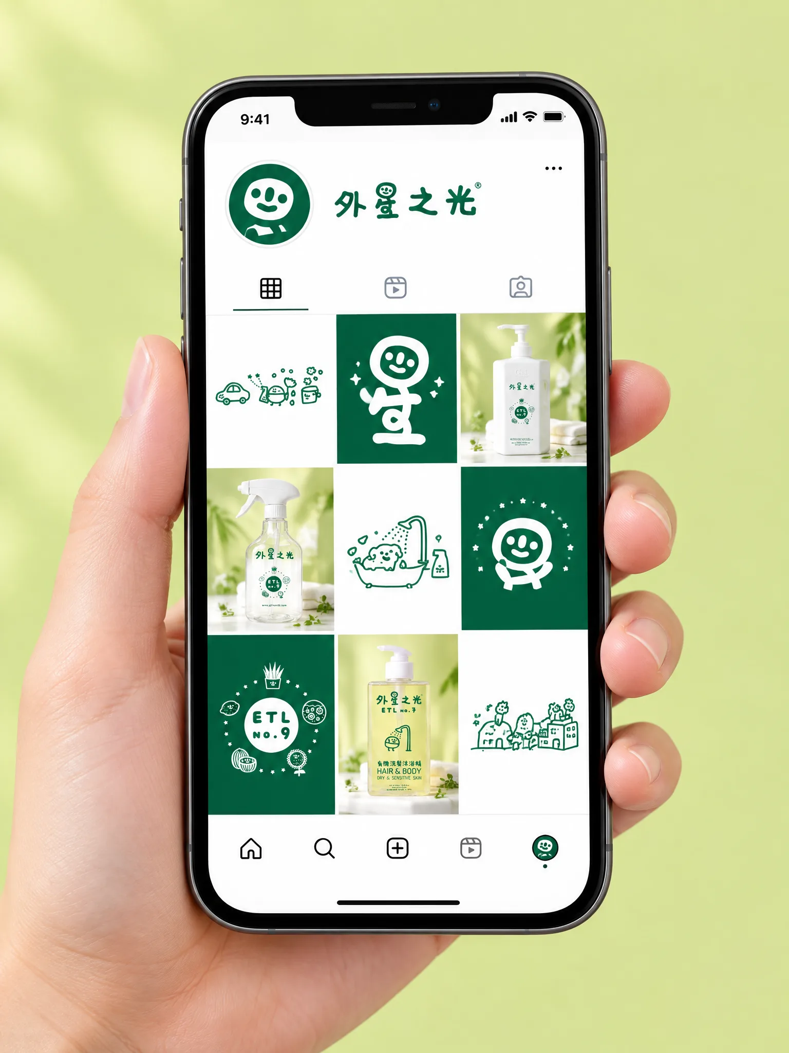
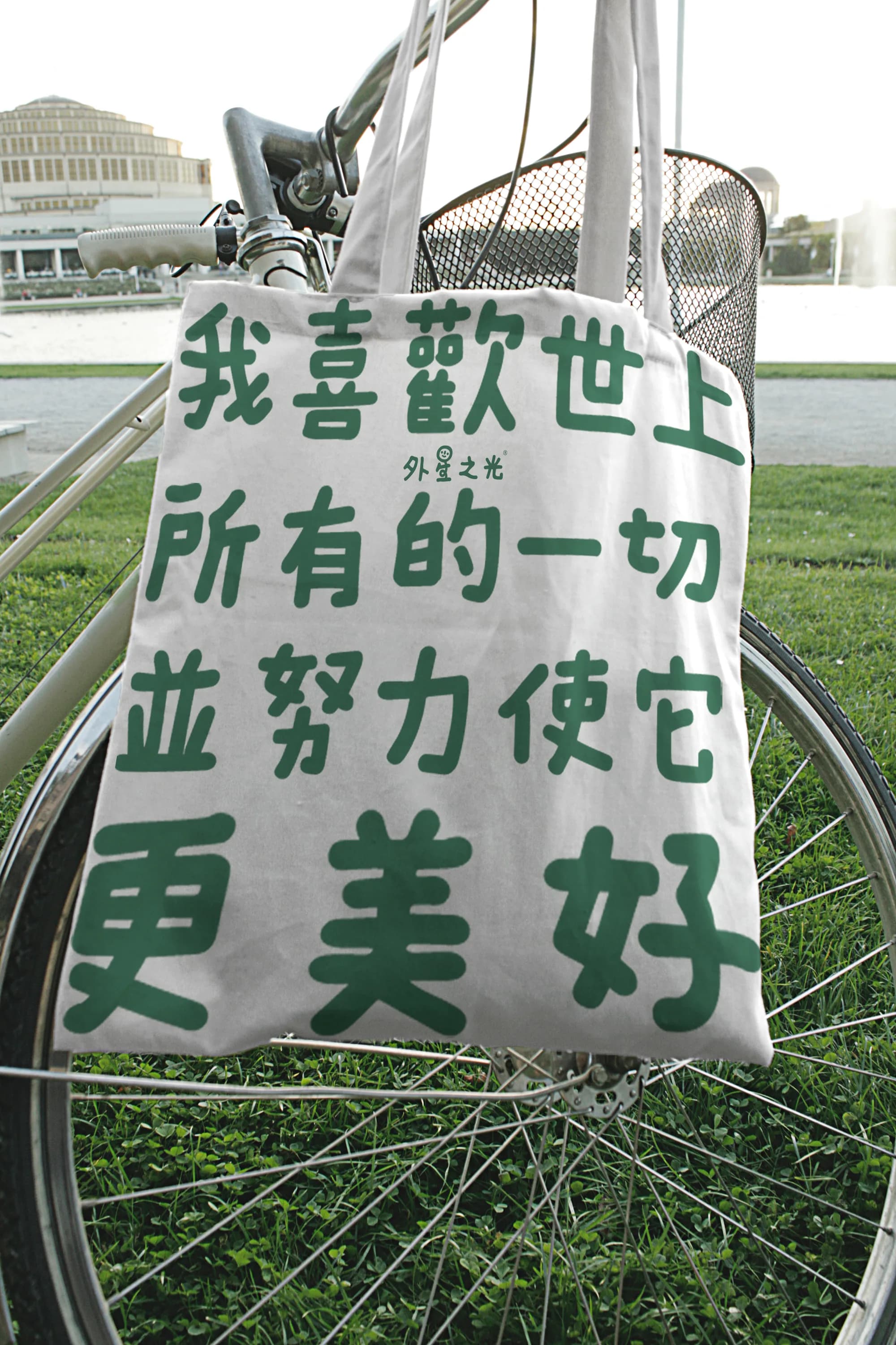
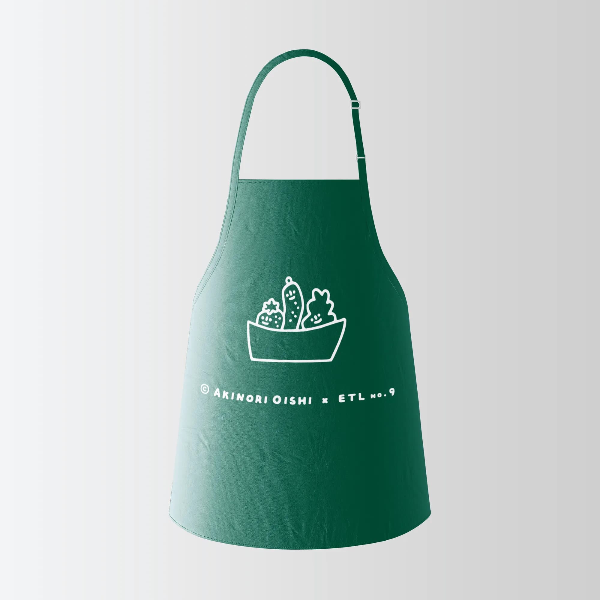
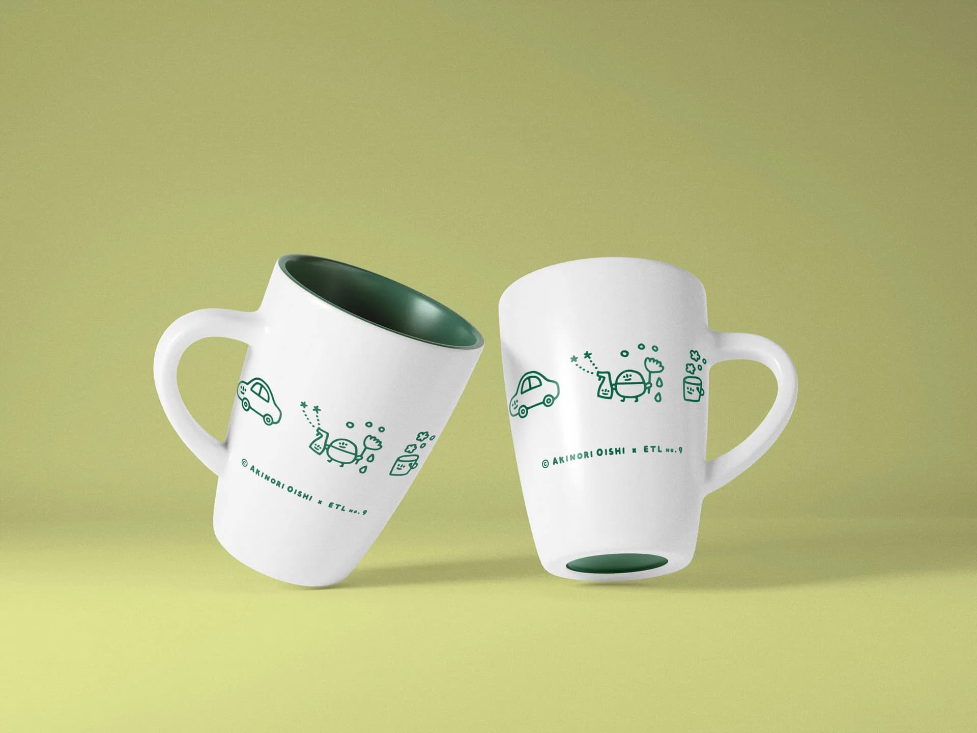
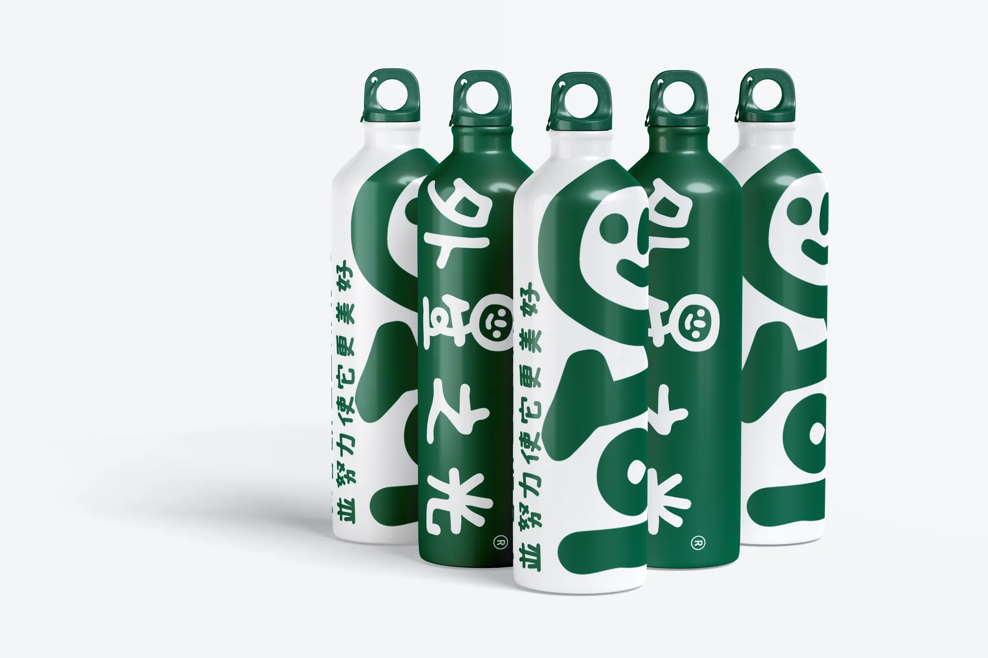
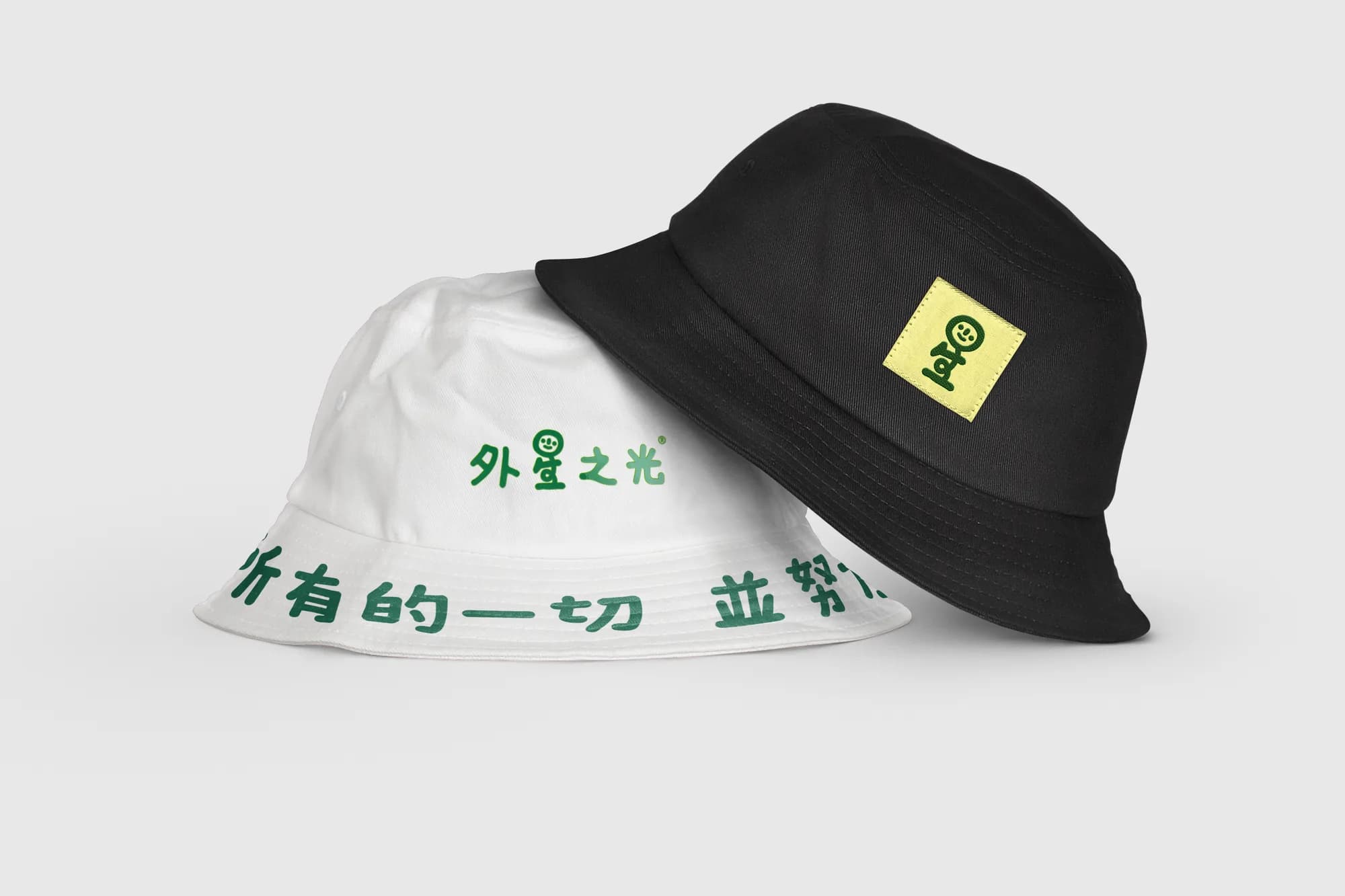
Turn the sad world into a happy one. Working with renowned Japanese multimedia artist Akinori Oishi, we redrew the mascot as a happy face sitting on a body of 生 (life, growth), together forming the character 星 (star): a small planet with a big promise to grow the world into a better place. The voice is child-like and innocent, the way a child looks at the world. Akinori's playful line illustrations show every use case, from dishes and laundry to pets and plants, so the packaging explains itself. One deep green on white carries it all, with the tagline 我喜歡世上所有的一切 並努力使它更美好: I love everything in the world, and I try to make it better.
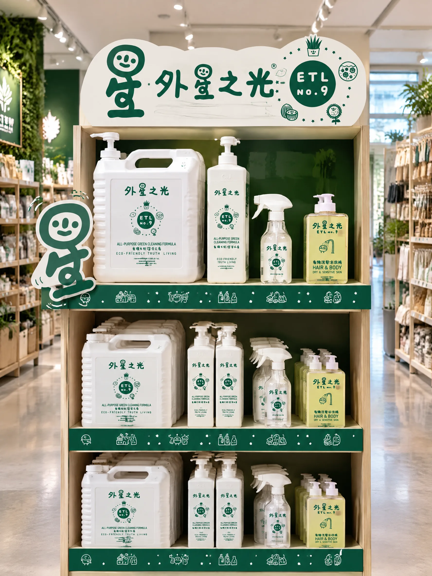
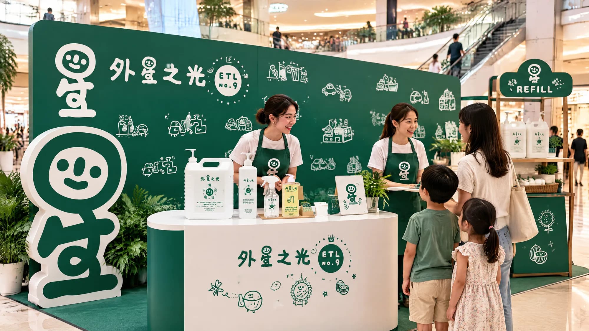
> Images marked (concept) are AI-generated scenes created for this portfolio to show the identity in use. The packaging, illustrations, marks, merch and website are the real work.


Side effects
- 01From gloomy to joyful, without losing the seriousness about the planet
- 02Self-explaining packaging: the illustrations do the instructions
- 03One system across shelf, web, social and merch


Open after hours
Ready for your fix?
Tell us what you are building. We reply within two working days, with honest advice even if we are not the right fit.
Get your fix