Packaging design for small brands: fix these before your next print run
 Desmond SumFounder & Creative Director
·3 min read
> The short answer
Before your next packaging print run, check four things: that the brand and product can be read from two metres away in about three seconds, that the information hierarchy is clear, that the whole range feels like one family across sizes and formats, and that the artwork is set up for your printer's specifications and has been checked on a physical proof.
Packaging is the one piece of branding that customers hold, compare and throw away. It is also expensive to get wrong, because mistakes are printed in thousands. This checklist covers the issues we see most often with small brands.
Does it pass the shelf test?
Print your pack at full size, put it on a shelf next to your competitors and step back two metres. Can you tell what the brand is and what the product is in about three seconds? If your pack looks like everything around it, colour and shape matter more than detail. Owning one bold colour or a distinctive shape is often more effective than a busier design.
Is the information hierarchy clear?
Most packs need to answer three questions, in order:
- What brand is this?
- What product is it? (dish soap, rice, shampoo)
- Which variant is it? (scent, size, flavour)
Everything else, including benefits, claims, instructions and legal information, comes after. When everything shouts at the same size, nothing gets read.
Does the range work as a family?
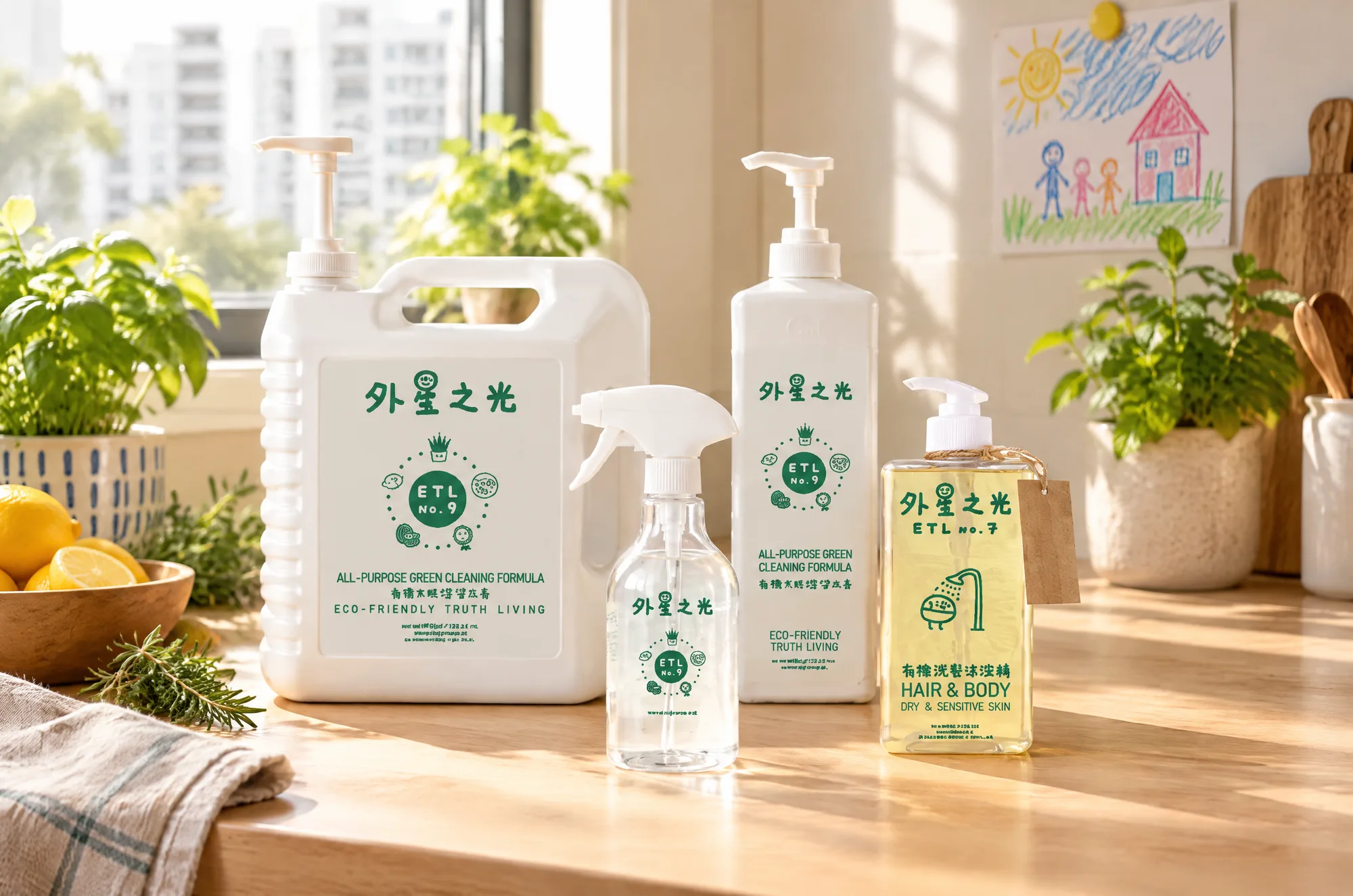
Ranges rarely come in one size. Spray bottles, refills and small travel sizes all need the same system to flex. When we redesigned the ETL home-care range, the products came in different bottle sizes and formats, so the layout had to work on a tall spray bottle and a smaller bottle without looking like different brands. See the ETL case study.
- Use a consistent grid: logo position, product name, variant colour.
- Use colour to code variants, but keep the brand colour constant.
- Design the smallest pack first. If it works small, it will work large.
Is the artwork print-ready?
- Correct dieline from your printer or packaging supplier, not a template found online.
- Bleed and safe areas as the printer specifies, with no text near folds or cuts.
- Colour mode: CMYK or specified spot colours (Pantone), not RGB screen colours.
- Fonts outlined or packaged, and images at print resolution.
- Finishes marked on separate layers: foil, spot UV, embossing, white ink on clear or metallic stock.
- Barcodes at the correct size and contrast, tested with a scanner.
Have you checked a physical proof?
Screens lie about colour, and flat PDFs lie about how a box folds. Ask for a physical proof or sample and check it in the light where the product will be sold. Look at colour, text legibility at actual size, fold alignment and how the pack sits on the shelf. Sign-off on a real proof is cheap insurance compared with reprinting a run.
What mistakes cost small brands the most?
- Designing on screen only, and seeing the pack in real life for the first time at delivery.
- Ordering the largest quantity for the lowest unit price, then needing to change the design.
- Squeezing in every claim, so the one that matters gets lost.
- Each new product designed separately, so the shelf looks like five brands.
- No one checking the printer's proof against the approved artwork.
Packaging with Dope Creatives
Hard Copy is our packaging, print and spatial graphics service. We design the system, prepare print-ready artwork per SKU and check proofs with your printer, so what arrives on the shelf matches what you approved.
Quick questions
How much does packaging design cost?
It depends on the number of SKUs, whether a new structure is needed and the finishing. A key pack with variant artwork is quoted differently from a full range with custom structures.
What is a dieline?
A dieline is the flat template of a pack showing cut, fold and glue lines. Artwork is designed on it so everything lines up when the pack is made.
Should packaging be designed in CMYK or Pantone?
Most packaging uses CMYK, with Pantone spot colours where a brand colour must be exact or bright. Your printer will advise what their process supports.